
Designing for expert complexity
At Volvo Cars, I led UX for method assessment in Unicon, a service-content platform supporting 120 users, including 60 content creators across 3 specialist groups. My focus was the engineers deciding which repair instructions needed to be created, updated or reused for each car project.
I combined expert research, service journey mapping and iterative design to make a fragmented workflow clearer, without removing the detail and flexibility engineers depended on. So that 7+ million Volvo vehicle owners all over the world can use their cars with ease.
Role
UX Lead
Team
UX, PM, EM and 10+ developers
Timeline
June 2025 - In use
Designing with Expert Users at Scale
Before workshop technicians can repair a car, engineers need to determine which service information it requires. A new model or model-year update can introduce changes to components, configurations and repair procedures. Method assessment is where engineers identify what those changes mean for the content they produce.
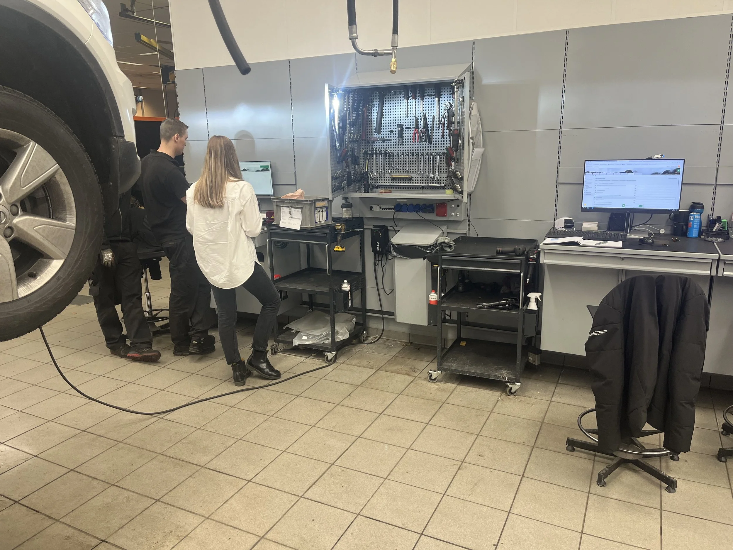
This work had been spread across 3 legacy authoring systems and several supporting tools. The first Unicon solution reduced tool switching, but parts of the workflow still depended on individual knowledge, personal contacts and free-text comments. Its rigid grouping model also did not reflect how engineers organized their work.
The users were a small group of method engineers with deep domain knowledge, working across complex data, technical dependencies and business-critical decisions.
The stakes went beyond usability. A missed change could affect the accuracy of repair information used by workshop technicians. I needed to make decisions easier to follow without oversimplifying the technical work behind them.
Understanding the decisions behind the interface
I started by learning how engineers actually assessed a car project, rather than treating the existing interface as the definition of their workflow.
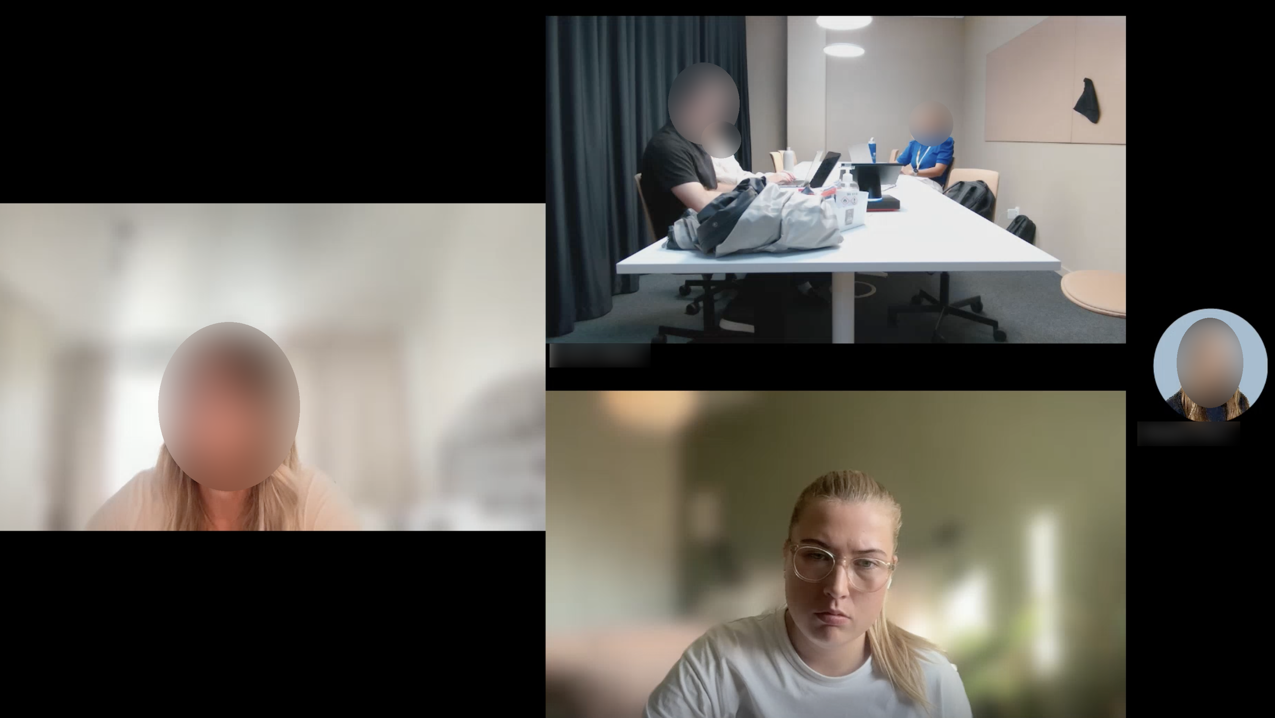
Through contextual interviews, screen-sharing sessions and think-aloud research, I explored how they interpreted technical data, investigated exceptions and decided whether to reuse, update or create repair content.
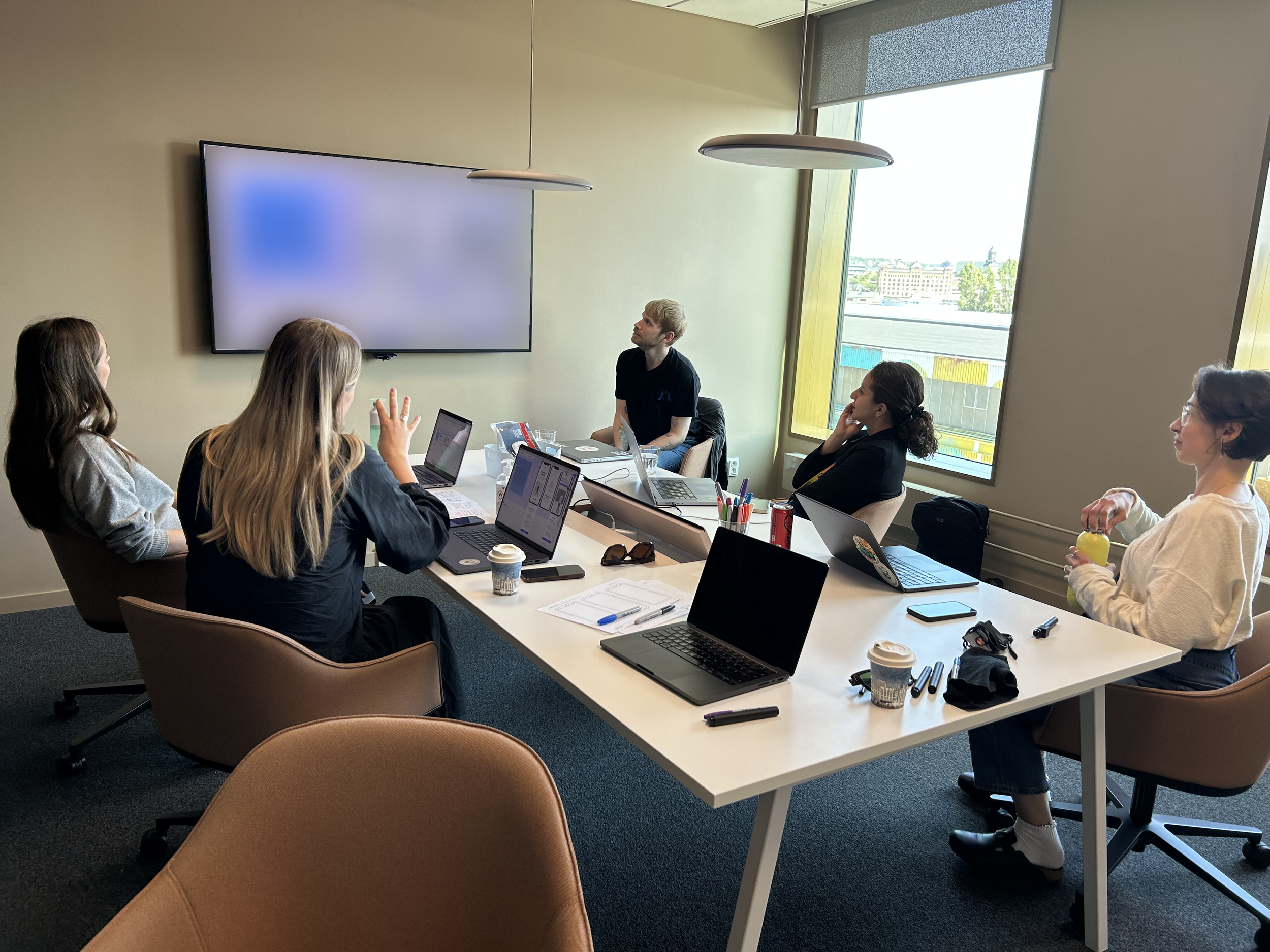
A recurring problem was not a lack of expertise. It was the effort required to find and connect the information needed to apply it. Engineers moved between systems and colleagues to understand whether a change mattered, while assessment progress and reasoning often remained buried in comments or memory.
Making the wider journey visible
I mapped the journey from upstream project data through assessment, content creation and publication in VIDA, Volvo Cars’ workshop-facing application.
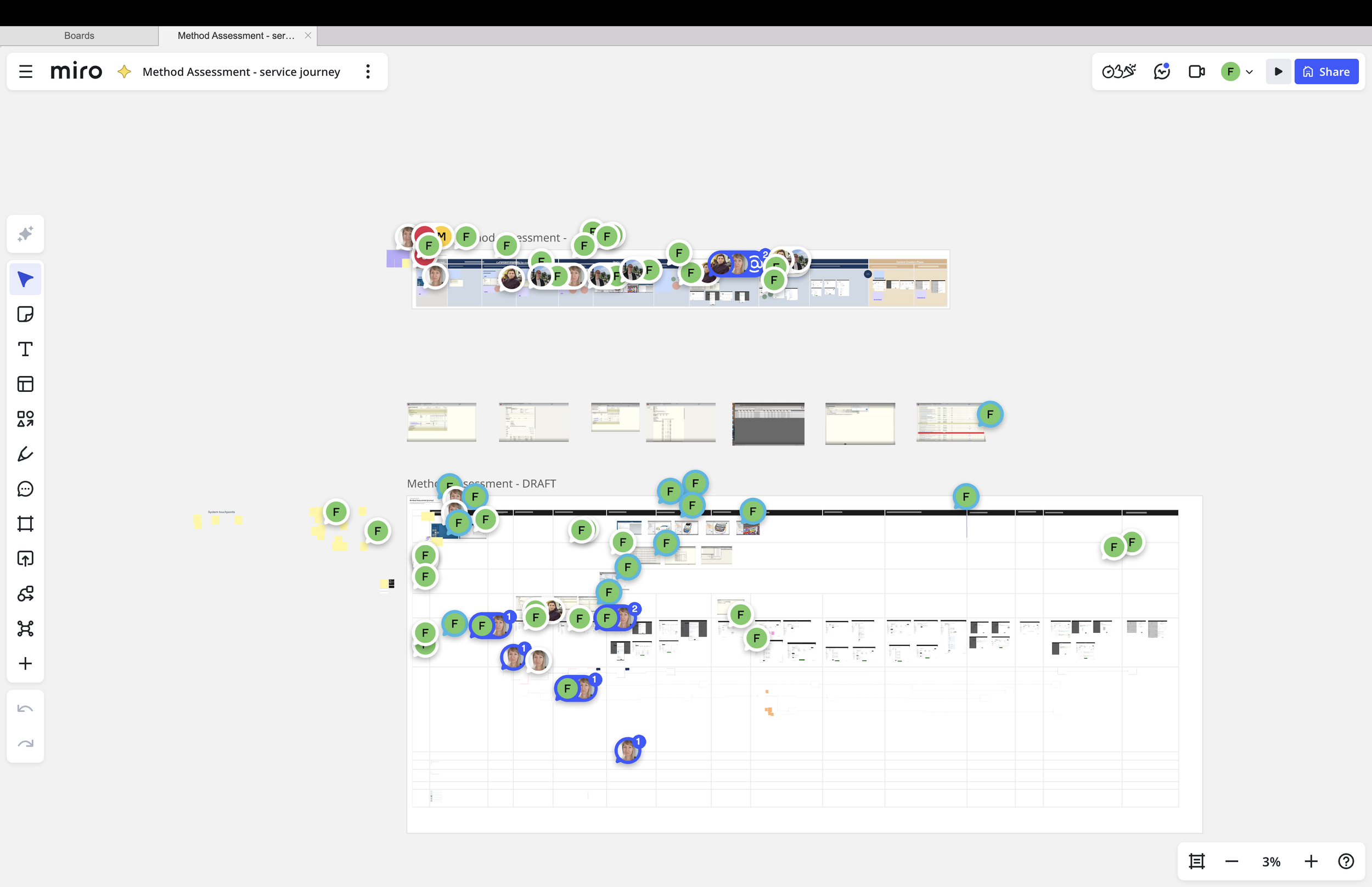
This helped UX, product and engineering see the workflow as a connected service rather than a collection of screens. It made decision points, dependencies and workarounds visible, including where the interface left engineers to bridge gaps themselves.
The journey became a shared foundation for discussing what the product should support and where design changes could make the greatest difference.
Testing decisions, not preferences
I used prototypes to test realistic assessment tasks. Engineers assigned work, filtered large lists, documented decisions and reviewed reusable method profiles.
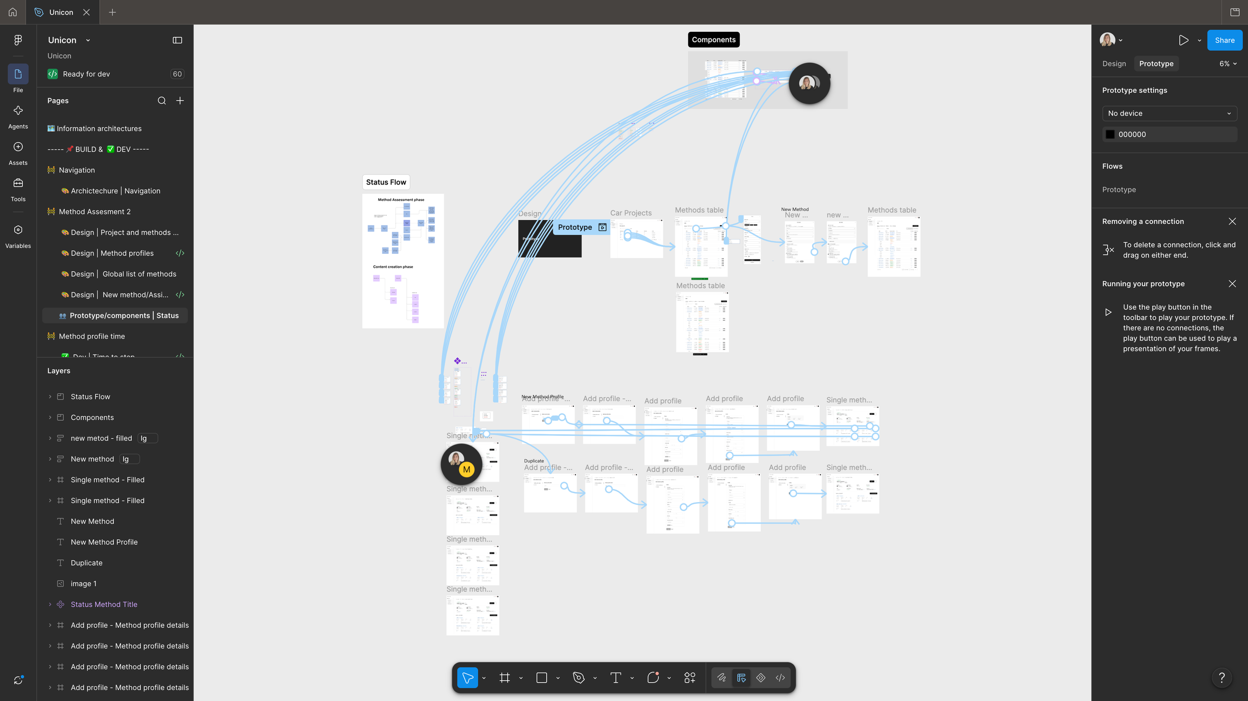
Rather than asking whether they liked the interface, I focused on practical questions:
Could they understand what needed attention?
Was the assessment status clear?
Could they find the information needed to make a decision?
Did they know what to do next?
Working with a small, highly specialised group also required judgement. I needed to distinguish individual preferences from recurring needs that could support different engineers and future car projects.
Turning research into 6 core design improvements
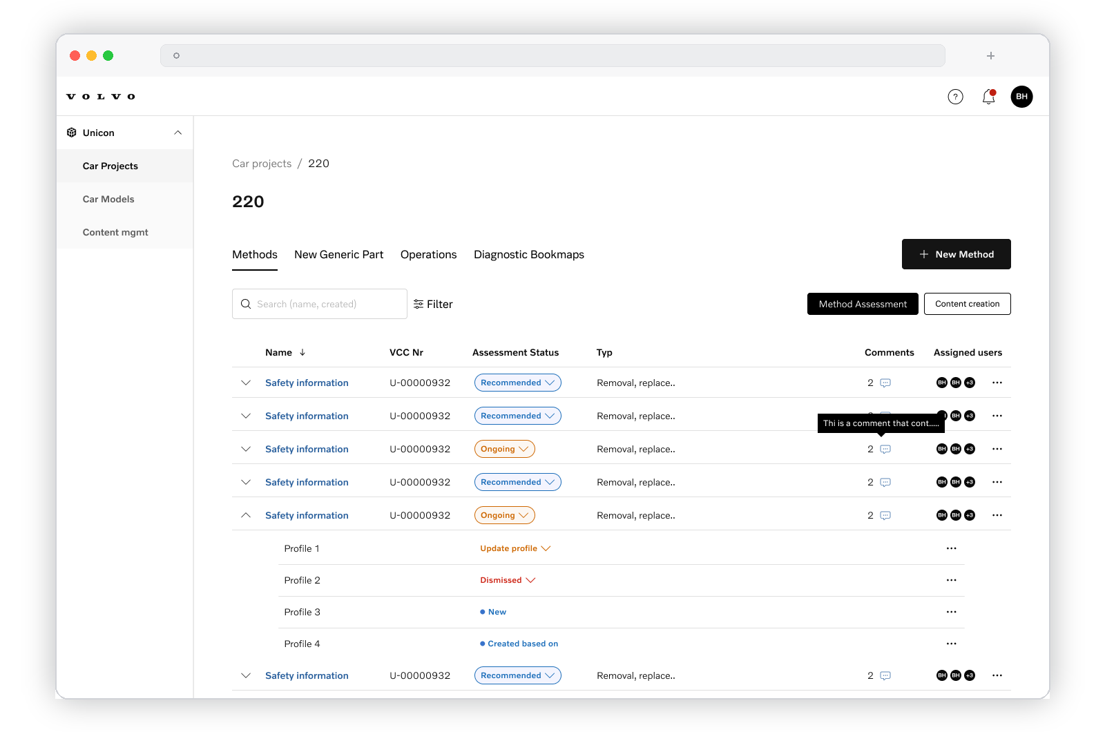
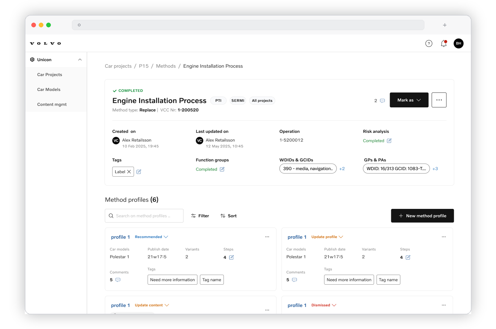
Flexible filtering
Replace rigid containers with filtering by assigned user, generic part and assessment status, so engineers could organize the view around their task.
Visible assessment statuses
Make progress explicit rather than leaving engineers to reconstruct it from memory or free-text comments.
Clear ownership
Support assignment across large projects, making responsibility visible alongside the work.
Contextual documentation
Keep notes and decision history where assessment happens, preserving the reasoning behind a decision.
Profile reuse support
Clarify when existing repair content could be reused, updated or replaced with a new profile.
Separation between assessment and creation
Distinguish deciding what information is needed from producing that information, giving each activity a clearer purpose.
Outcome
Leading the work beyond design
I translated findings into a prioritized UX backlog and worked closely with product and engineering to refine feasible improvements.
Regular product-trio updates, early design-and-development reviews and hands-on testing of implemented solutions kept UX involved throughout delivery. This helped surface implementation gaps earlier and gave the team a shared way to balance immediate needs with longer-term product quality.
My contribution was not only to design the workflow, but also to keep user needs present in the decisions that shaped it.
Reflection: simplify the friction, not the expertise
This project reinforced that designing for experts does not mean making every task simple. Some complexity is essential to the work.
The design challenge is to distinguish that necessary complexity from the friction created by fragmented tools, unclear states and missing context. My role was to learn from specialist users, make their decision logic understandable to the team and translate it into product improvements without taking control away from the people doing the work.